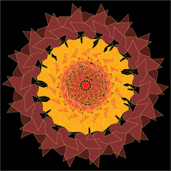
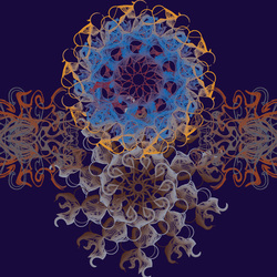
Digital Blend Balance
This was a design done in Illustrator. The design was made from a shape that was spirographed. Then I made another shape with less sides than the first and spirographed it too. I blended them so it created that really dense shape and fill.
Radial Asymmetrical
This design was done in Illustrator. It was meant to look uneven to show that all designs didn't have to be symmetrical.
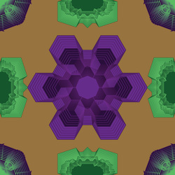
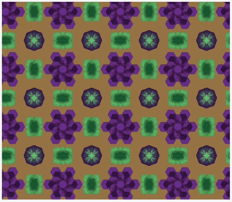
Symmetrical Balance Design
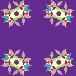
This was a design done in Illustrator. What I had to do was make the original design and find a way to make it so the pattern/design was able to be symmetrical, even, on all sides in whatever way you could fold it.
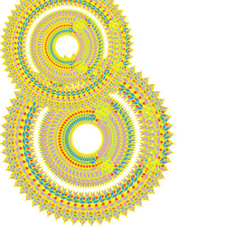
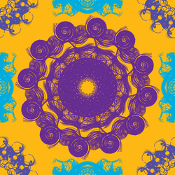
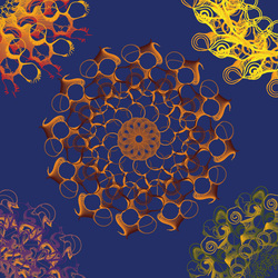
Concentric Design
This design was created from radial designs that shared the same center point. When I made this design, I was thinking about a sun and a volcano if you looked down into the center. I chose these themes to create my color scheme because the basic outline also reminded me of a sun or a volcano.
Analogous Pattern
The pattern was composed of colors that were next to each other on the color wheel like red, orange, and yellow. My pattern used the colors from blue to purple. I used lines that were altered by pushing them around or twirling them.
Typography Pattern
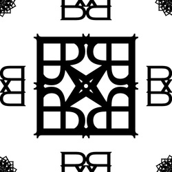
This pattern was designed from using the letter 'R' and in the Copperplate Gothic Light font. I proceeded to mirror, rotate, and transform the letter into the different designs as shown.
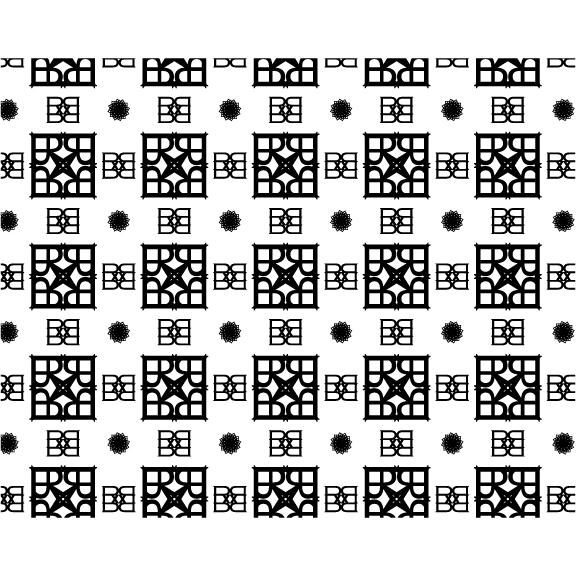
Typography
Monochrome Pattern
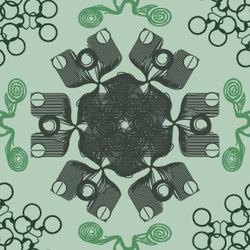
This pattern was made using lines and various warp tools. My inspiration for this little pattern was science and chemistry. The circles in the corners are supposed to represent chemical bonds while the center is machinery and technology. The frog-like swirls on the sides are for life and biology. However, the pattern had to use one color and its various shades and tints so I went with a green because I normally associate science with green.
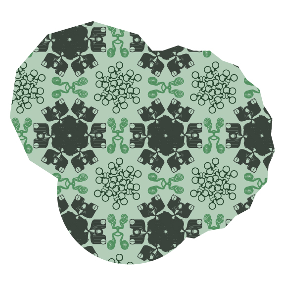
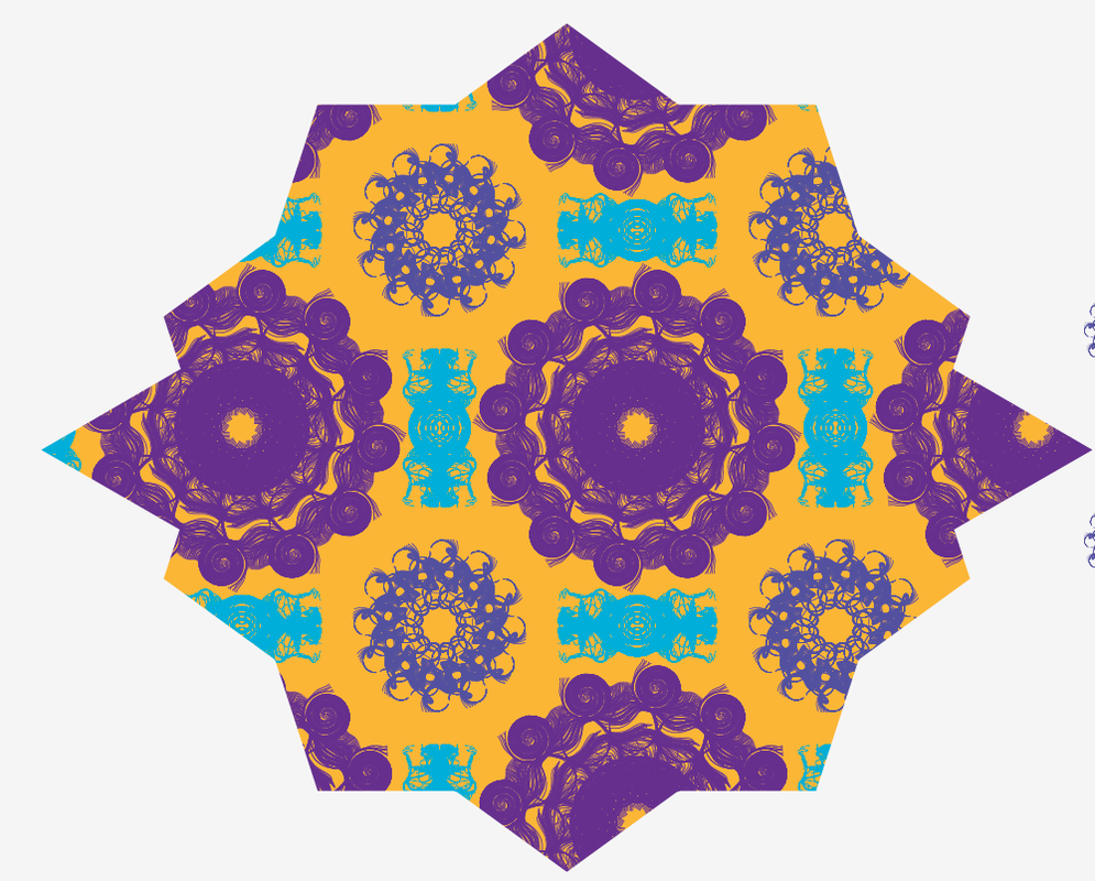
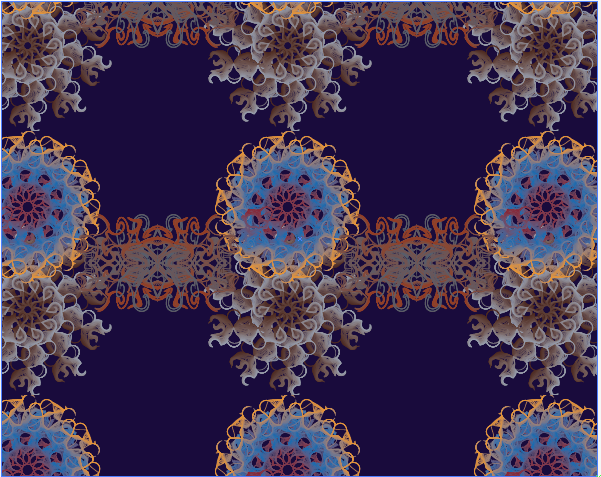
Pattern in action
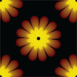
Flower Pattern
This pattern was done in Illustrator. The basis of this pattern was from flowers blooming.
Naturalistic
This pattern was based off things in nature you would see. Each shape represents something and would probably have a different meaning to the viewer. However, when I made the pattern I had some weird amalgation, mixture, of the circles which looked color.
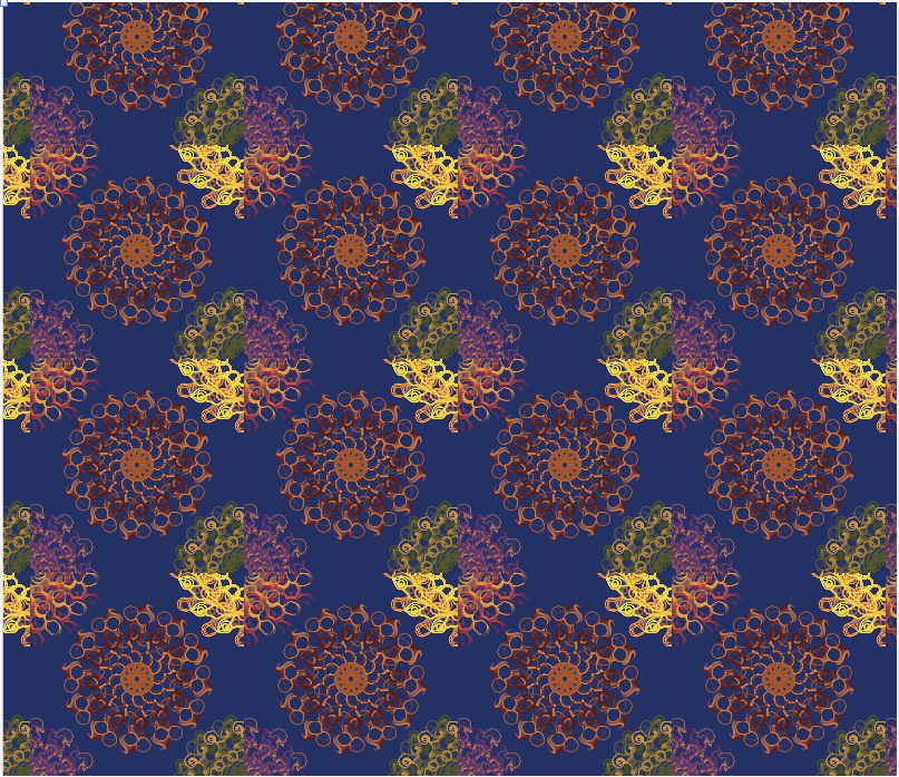
Photo Color Pattern
For this pattern, I had to find a picture that had a variety of colors. I decided to go with an image of a very colorful spider called the Peacock Spider. When I found the image, I opened up Adobe Illustrator and had to take some colors from it to use in my design. I made my design out of lines that pushed, bloated, puckered, and even crystallized while making them into a circular shape. It reminds me of the spider image I found.
Spider Pattern
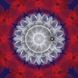
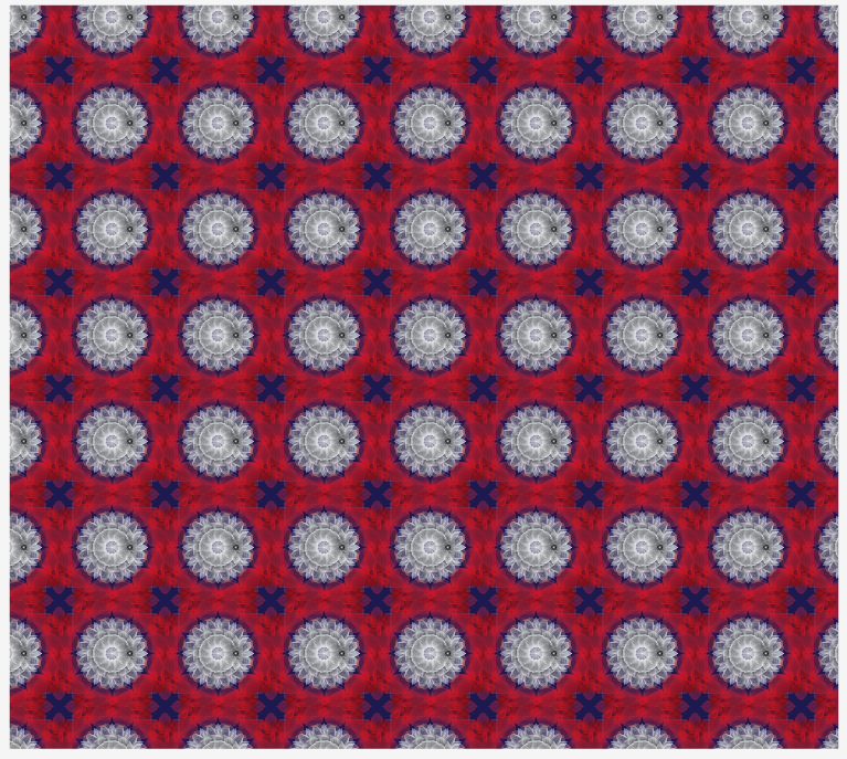
Triad Color Pattern
This pattern was made of three colors from different points on a color wheel. This is called a triad because the colors were in a formation that made a triangle. Something I decided to do was make the design look like it had depth.
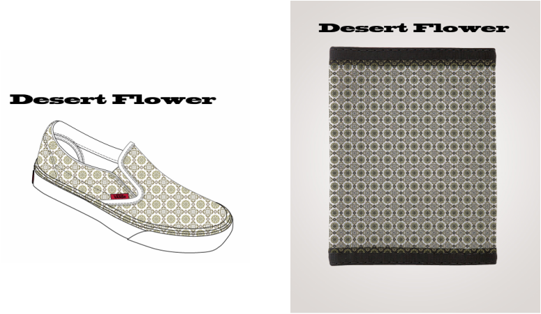
Desert Flower Design
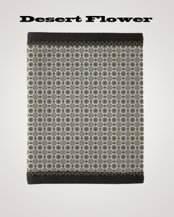
This is a design I am very proud of. I created it in Adobe Illustrator. I started with picking out the colors and instead of using vibrant, bright and eye catching, colors, I wanted to get some simple to look at tones. That's how I created these earth-like tones. Then I started a basic shape and star and merged those two together. I followed it up with "cutting" out random designs and constantly cloning/rotating the designs.
Pen Tool Scissors
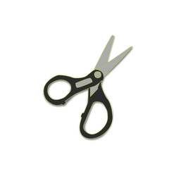
This picture was done in order to show how originally proficient I was in Adobe Illustrator when using the Pen Tool. When I created the scissors, I felt pretty comfortable with the tool as I had experience with it before.
Illustrator Portrait
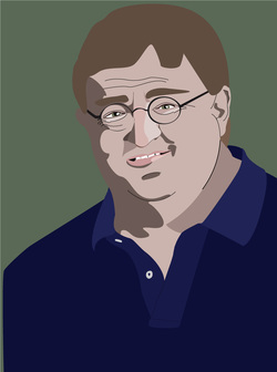
This project was for Visual Communications. We had to choose someone we know, famous or not, and find a photo of them, preferably clear without any blurring. We had to create a portrait of them in Illustrator by using the pen tool. For my person, I chose Gabe Newell, a well known game developer and manager of Valve. I traced his face and body first then made the other blobs for shades and tints. This project helped me excel in design thinking because I made a portrait out of lines and random shapes to recreate the photo to the best of my ability.
Gabe Newell 2
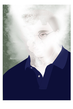
This image is a portrait of a famous game developer. This portrait was done in Adobe Illustrator. In order to make this portrait, I had to learn about light and dark values in relation to color. I also had to learn about form, the shapes that help make the picture. This person is Gabe Newell. He is a co-founder of the company Valve Corporation, which is a major company when it comes to computer games. I chose him because I like playing games and I do have games that his company made. As a person, I find him interesting as he can be found enjoyable to talk to and do things with. Also I made his face covered by/turning into steam because a program he helped develop is called Steam.
3D Modo Project
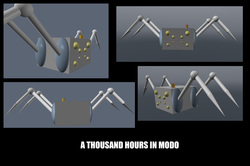
This little project was for Means’ class. Since we had the option to choose our projects, I decided to go with a creation of a 3D model of whatever I could think of. I got the idea for this model from sketches I made as a freshman. I chose the sketch and 3D modeling because I am interested in getting into game design as a career and because I found these sketches had potential, other than just being in my binder. However, I knew that I would be limited to the simplest design because of my lack of skill in 3D modeling. This 3D model was made in Modo, a 3D modeling / animating / rendering program. This 3D model was very difficult to make and color because it required me to learn and use things in Modo I have never understood or used before. Despite all the issues and time it took, I am happy with this outcome and the way it looks.
Standard Oil Final
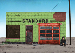
This picture was done for our final in Viscom. We had to take a black and white photo of a Standard Oil building and colorize it. We could color it anyway we wanted to, but I wanted to get colors that still showed how old the building was. I also had to add in a photo of myself , so I took a picture of myself sitting against a wall.
